Python for Undergraduate Engineers
  • About
  • Book
  • Gear
  • Now
  • Archives
  1. Categories
  2. matplotlib

Plotting a Stress Strain Curve with Python and Matplotlib

Date Fri 17 May 2019 Tags python / matplotlib / engineering / jupyter / notebook

stress strain curve

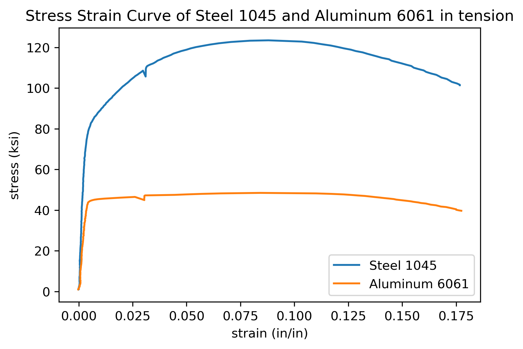
In this post, we'll use data from a tensile test to build a stress strain curve with Python and Matplotlib.

A tensile test is a type of mechanical test performed by engineers used to determine the mechanical properties of a material. Engineering metal alloys such as steel and aluminum alloys …

more ...

Plotting Bond Energy vs. Distance with Python and Matplotlib

Date Wed 03 April 2019 Tags python / matplotlib / engineering / plotting / jupyter notebook

bond energy vs. distance curve

Atoms in solid materials like steel and aluminum are held together with chemical bonds. Atoms of solid materials are more stable when they are chemically bonded together, and it takes energy to separate atoms which are joined together with a chemical bond. The bonding energy associated with a chemical bond …

more ...

Plotting a Gaussian normal curve with Python and Matplotlib

Date Sat 02 February 2019 Tags python / engineering / statistics / matplotlib / scipy

Area Under Normal Curve Plot

In the previous post, we calculated the area under the standard normal curve using Python and the erf() function from the math module in Python's Standard Library. In this post, we will construct a plot that illustrates the standard normal curve and the area we calculated. To build the Gaussian …

more ...

Quiver plots using Python, matplotlib and Jupyter notebooks

Date Wed 14 November 2018 Tags python / matplotlib / engineering / plotting / jupyter notebook

3 quiver plots 
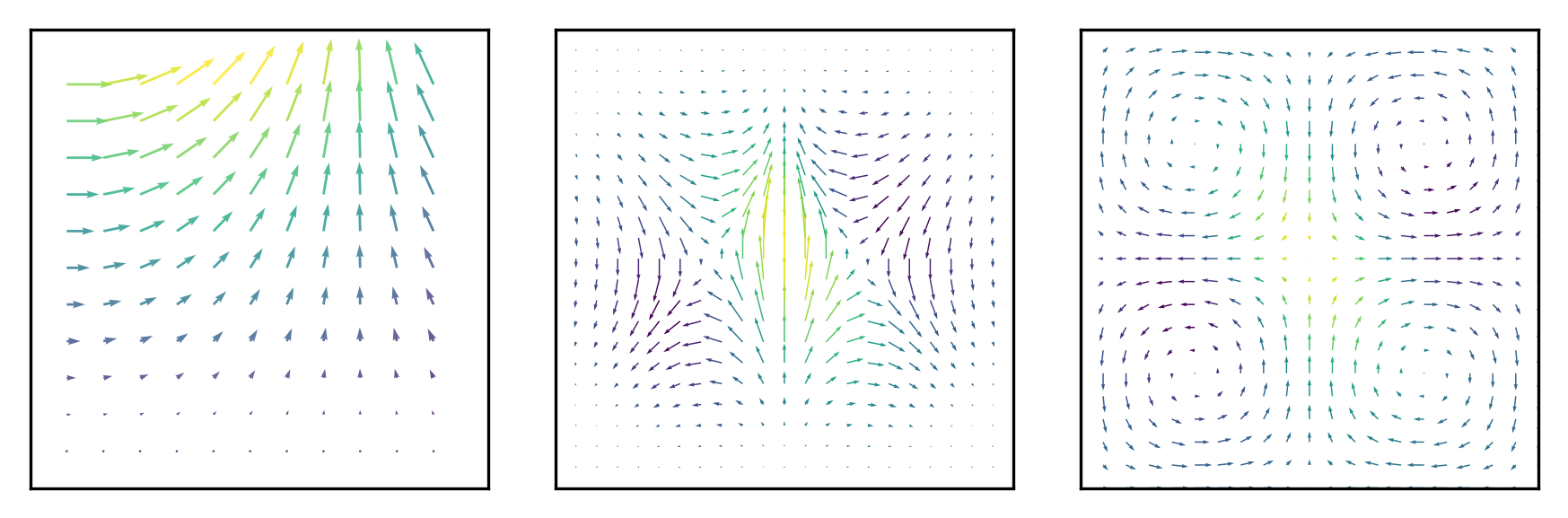
A quiver plot is a type of 2D plot that shows vector lines as arrows. Quiver plots are useful in electrical engineering to visualize electrical potential and valuable in mechanical engineering to show stress gradients. In this post, we will build three quiver plots using Python, matplotlib, numpy, and Jupyter notebooks.

more ...

Plotting Histograms with matplotlib and Python

Date Mon 08 October 2018 Tags python / matplotlib / engineering / statistics / plotting / jupyter notebook

histogram

Histograms are a useful type of statistics plot for engineers. A histogram is a type of bar plot that shows the frequency or number of values compared to a set of value ranges. Histogram plots can be created with Python and the plotting package matplotlib. The plt.hist() function creates …

more ...

  • «
  • 1
  • 2
  • 3
  • »

About Peter Kazarinoff
I teach engineering at a community college in the Pacific Northwest. I am interested in programming and how to help students. Here I mostly blog about Python, and how programing can be incorporated into engineering education.

  • Recent Posts

    • How to add an Inset Curve with Matplotlib and Python
    • Crank and Rocker Motion with Python and Matplotlib
    • How to make animated plots with Matplotlib and Python
  • Tags

    • engineering
    • flask
    • jupyter
    • jupyter notebook
    • matplotlib
    • microcontroller
    • micropython
    • pelican
    • python
    • sensor
  • GitHub Repos

    Status updating...

    @professorkazarinoff on GitHub

© 2021 Peter Kazarinoff · Powered by pelican-bootstrap3, Pelican, Bootstrap

Back to top