In the previous post, we calculated the area under the standard normal curve using Python and the erf() function from the math module in Python's Standard Library. In this post, we will construct a plot that illustrates the standard normal curve and the area we calculated. To build the Gaussian normal curve, we are going to use Python, Matplotlib, and a module called SciPy.
Calculating the probability under a normal curve is useful for engineers. This type of calculation can be helpful to predict the likely hood of a part coming off an assembly line being within a given specification when the statistical properties of all the parts that have come of the assembly line previously are known.
In this post, we will calculate the probability under the normal curve to answer a question like the one below:
GIVEN:
At a facility that manufactures electrical resistors, a statistical sample of 1-kΩ resistors is pulled from the production line. The resistor's resistances are measured and recorded. A mean resistance of 979.8 kΩ and a standard deviation of 73.10 kΩ represents the sample of resistors. The desired resistance tolerance for the 1-kΩ resistors is ± 10%. This tolerance range means the acceptable range of resistance is 900 Ω to 1100 Ω.
FIND:
Assuming a normal distribution, determine the probability that a resistor coming off the production line will be within spec (in the range of 900 Ω to 1100 Ω). Show the probability that a resistor picked off the production line is within spec on a plot.
SOLUTION:
To build the plot, we will use Python and a plotting package called Matplotlib. We will also use the norm() function from SciPy's stats library. Both Matplotlib and SciPy come included when you install Anaconda. If you do not have Anaconda installed, Matplotlib and SciPy can be installed from the command line with pip.
$ pip install matplotlib
$ pip install scipy
Before we build the plot, let's take a look at a gaussin curve. The shape of a gaussin curve is sometimes referred to as a "bell curve." This is the type of curve we are going to plot with Matplotlib.
Create a new Python script called normal_curve.py. At the top of the script, import NumPy, Matplotlib, and SciPy's norm() function. If using a Jupyter notebook, include the line %matplotlib inline. If you are not using a Jupyter notebook, leave %matplotlib inline out as %matplotlib inline is not a valid line of Python code.
# normal_curve.py

import numpy as np
import matplotlib.pyplot as plt
from scipy.stats import norm
# if using a Jupyter notebook, inlcude:
%matplotlib inline
Next, we need to define the constants given in the problem. The mean is 979.8 and the standard deviation is 73.10. The lower bound is 900 and the upper bound is 1100.
# define constants
mu = 998.8
sigma = 73.10
x1 = 900
x2 = 1100
Next, we calculate the Z-transform of the lower and upper bound using the mean and standard deviation defined above.
# calculate the z-transform
z1 = ( x1 - mu ) / sigma
z2 = ( x2 - mu ) / sigma
After the Z-transform of the lower and upper bounds are calculated, we calculate the probability with SciPy's scipy.stats.norm.pdf() function.
x = np.arange(z1, z2, 0.001) # range of x in spec
x_all = np.arange(-10, 10, 0.001) # entire range of x, both in and out of spec
# mean = 0, stddev = 1, since Z-transform was calculated
y = norm.pdf(x,0,1)
y2 = norm.pdf(x_all,0,1)
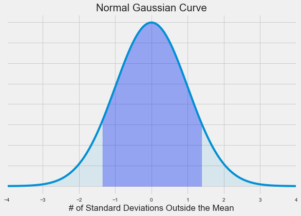
Finally, we build the plot. Note how Matplotlib's ax.fill_between() method is used to highlight the area of interest. We'll use Matplotlib's 'fivethirtyeight' style and save the figure as 'normal_curve.png'.
# build the plot
fig, ax = plt.subplots(figsize=(9,6))
plt.style.use('fivethirtyeight')
ax.plot(x_all,y2)

ax.fill_between(x,y,0, alpha=0.3, color='b')
ax.fill_between(x_all,y2,0, alpha=0.1)
ax.set_xlim([-4,4])
ax.set_xlabel('# of Standard Deviations Outside the Mean')
ax.set_yticklabels([])
ax.set_title('Normal Gaussian Curve')

plt.savefig('normal_curve.png', dpi=72, bbox_inches='tight')
plt.show()
The finished plot is below. Notice how the area corresponding to resistors in the given specification (between the upper and lower bounds) is shaded.