Engineers collect data and make conclusions based on the results. An important way to view results is with statistical charts. In this post we will build a bar chart to compare the tensile strength of 3D-printed ABS plastic compared to the tensile strength of 3D-printed HIPS plastic. We will add error bars to the chart to show the amount of uncertainty in the data. In the bar plot we construct, the height of the bars will represent the mean or average tensile stength. One bar will represent the average strength of ABS and the other bar will show the average strength of HIPS. We will then add error bars to the plot which will represent +1/-1 standard deviation about the mean.
We will use Python, the statistics module (part of the Python standard library), and matplotlib to build the bar plot. I recommend that undergraduate engineers use the Anaconda distribution of Python, which comes with matplotlib already installed. For help installing Anaconda, see a previous blog post: Installing Anaconda on Windows 10. If matplotlib is not available in your version of Python, open a terminal or the Anaconda Prompt and type:
$ pip install matplotlibor
> conda install matplotlibThe data we are going to plot is from the tensile testing of two different kinds of 3D-printed plastic, ABS and HIPS (HIPS stands for High Impact Polystyrene). You can download the data using the link below:
3D-printed-tensile-bar-data.xlsx
I'm constructing the plot in a jupyter notebook. You could also build the code in a .py file and run the code to produce the plot.
A note about using matplotlib on MacOSX: if you recieve an error message that matplotlib is not installed as a framework, consider using the Anaconda distribution of Python and running the code in a jupyter notebook.
To open a new jupyter notebook go to the Anaconda Prompt or a terminal and type:
> jupyter notebookAlternativly, you can start a new jupyter notebook by cliking the Windows start button and searching for [Anaconda3] --> [Jupyter Notebook]
If jupyter is not installed on your system, you can install it using the Anaconda Prompt or use a terminal and pip:
> conda install jupyteror
$ pip install jupyterAt the top of the jupyter notebook (or .py file), we need to import the required packages:
- statistics (part of the Python standard library, but still needs to be imported) and
- matplotlib
From the statistics module we will import two functions: mean (average) and stdev(standard deviation). If we use this import line:
from statistics import mean, stdevWe can use the names mean() and stdev() in our code. However, if we use a more general import line:
import statisticsThen we will need to call statistics.mean() and statistics.stdev() in our code.
matplotlib also needs to be imported. The typical way to do this is with the line:
import matplotlib.pyplot as pltThen thoughout our code, we can use plt() instead of writing out matplotlib.pyplot() each time we want to use a matplotlib method.
The %matplotlib inline magic command is added so that we can see our plot right in the jupyter notebook. If you build the plot in a .py file, the %matplotlib inline command should be left out as it will return an error.
# import packages
from statistics import mean, stdev
import matplotlib.pyplot as plt
#include if using a jupyter notebook, remove if using a .py file
%matplotlib inline
Create two variables which contains the data for ABS and HIPS as a list of individual tensile strength values.
After the import lines, we need to create two variables: one variable for the ABS data and one variable for HIPS data. We will assign the data points as a list of numbers saved in two variables. The general format to create a list in Python is to use list_name = [item1, item2, item3] with square brackets on the outside and commas between the items. The items for the two lists came from the .xlsx file that contains the data (3D-printed-tensile-bar-data.xlsx). The tensile strength is in column [F] labeled [Tensile Strength (Mpa)]. Rows 2-17 contain data for ABS and rows 18-37 contain data for HIPS.
# data
ABS = [18.6, 21.6 ,22, 21, 18, 20.9, 21, 19.3, 18.8, 20, 19.4, 16, 23.8, 19.3, 19.7, 19.5]
HIPS = [10.4, 4.9, 10.2, 10.5, 10.9, 12.9, 11.8, 8.4, 10, 10.6, 8.6, 9.7, 10.8, 10.7, 11, 12.4, 13.3, 11.4, 14.8, 13.5]
Find the mean and standard deviation for each set of data
We'll use the mean() and stdev() functions from the statistics module to find the mean (or average) and standard deviation of the two data sets. A summary of these two functions is below:
| statistics module function | description |
|---|---|
mean() |
calculate the mean or average of a list of numubers |
stdev() |
calculate the standard deviation of a list of numbers |
# find the mean using the mean() function from the statistics library
ABS_mean = mean(ABS)
HIPS_mean = mean(HIPS)

# find the standard deviation using the stdev() function from the statistics library
ABS_stdev = stdev(ABS)
HIPS_stdev = stdev(HIPS)
Build a simple bar plot
Matplotlib's bar plot fuction can be accessed using plt.bar(). We need to include at least two arguments as shown below:
plt.bar (['list', 'of' ,'bar', 'labels'], [list, of, bar, heights])We will pass in ['ABS', 'HIPS'] for our list of bar labels, and [ABS_mean, HIPS_mean] for our list of bar heights. The command plt.show() will show the plot in a jupyter notebook or show the plot in a new window if running a .py file.
# Build a bar plot
plt.bar(['ABS', 'HIPS'],[ABS_mean, HIPS_mean])
plt.show()

Add axis labels and title
The plot looks pretty good, but we should add axis labels (with units) and a title to our plot. We can add the axis labels and titles with plt.xlabel(), plt.ylabel() and plt.title(). We need to pass in strings enclosed in quotes ' ' with these methods. A summary of the matplotlib functions is below:
| matplotlib function | description |
|---|---|
plt.bar() |
build a bar plot |
plt.xlabel() |
x-axis label |
plt.ylabel() |
y-axis label |
plt.title() |
plot title |
plt.show() |
show the plot |
# build a bar plot
plt.bar(['ABS', 'HIPS'],[ABS_mean, HIPS_mean])
plt.xlabel('3D-printer Fillament Material')
plt.ylabel('Tensile Strength (MPa)')
plt.title('Tensile Strength of 3-D Printed ABS and HIPS Tensile Bars')
plt.show()

Add error bars to the plot
We have a nice looking bar plot with two bars, x-axis label, y-axis label and a title. Next we will add error bars to the plot. We will add the error bars by passing a keyword argument in the plt.bar() function. The keyword argument is yerr = [list, of, error, bar, lengths]. A keyword argument is a specific type of argument passed to a function or method that must have a name associated with it. Regular function arguments just need to be in the proper order. Keyword arguments need to be pass with the form keyword_argument_name = value. The general form of the entire plt.bar() line will be:
plt.bar (['list', 'of' ,'bar', 'labels'], [list, of, bar, hights], yerr=[list, of, error, bar, lengths])The first two arguments, ['list', 'of' ,'bar', 'labels'] and [list, of, bar, hights] just need to be in the correct order. The third argument, a keyword argument needs to include yerr =.
Our list of error bar lengths will contain the standard deviation for each set of data, ABS_stdev and HIPS_stdev.
yerr=[ABS_stdev, HIPS_stdev]# build a bar plot
plt.bar(['ABS', 'HIPS'],[ABS_mean, HIPS_mean],yerr=[ABS_stdev, HIPS_stdev])
plt.xlabel('3D-printer Fillament Material')
plt.ylabel('Tensile Strength (MPa)')
plt.title('Tensile Strength of 3-D Printed ABS and HIPS Tensile Bars')
plt.show()

Add "caps" to the error bars
The error bars are on the plot, but they are just vertical lines. Typically, error bars have a horizontal lines at the top and bottom and look sort of like the capital letter I.
We can add these horizontal lines or "caps" to the top and bottom of the error bars by passing an additional keyword argument to the plt.bar() function called capsize=. We will set the capsize=10, which is a good size for this plot. You can change the capsize= number to make the horizontal lines longer or shorter.
Now our plt.bar() function call contains 4 different arguemnts:
plt.bar (['list of bar labels'], [list of bar hights], yerr = [list of error bar lengths], capsize = width)A summary of the arugments passed to the plt.bar() function is below:
| plt.bar() Arguments | description |
|---|---|
[list of bar labels] |
1st argument, a list of strings which provide the labels below the bars |
[list of bar heights] |
2nd argument, a list of numbers which determines the height of each bar |
yerr = [list of error bar lengths] |
a keyword argument, must include yerr =. Denotes the height of the error bars. Needs to be a list of numbers |
capsize = width |
a keyword argument, must include capsize =. Denotes the width of the error bar horizontal "caps". Needs to be a number, not a string |
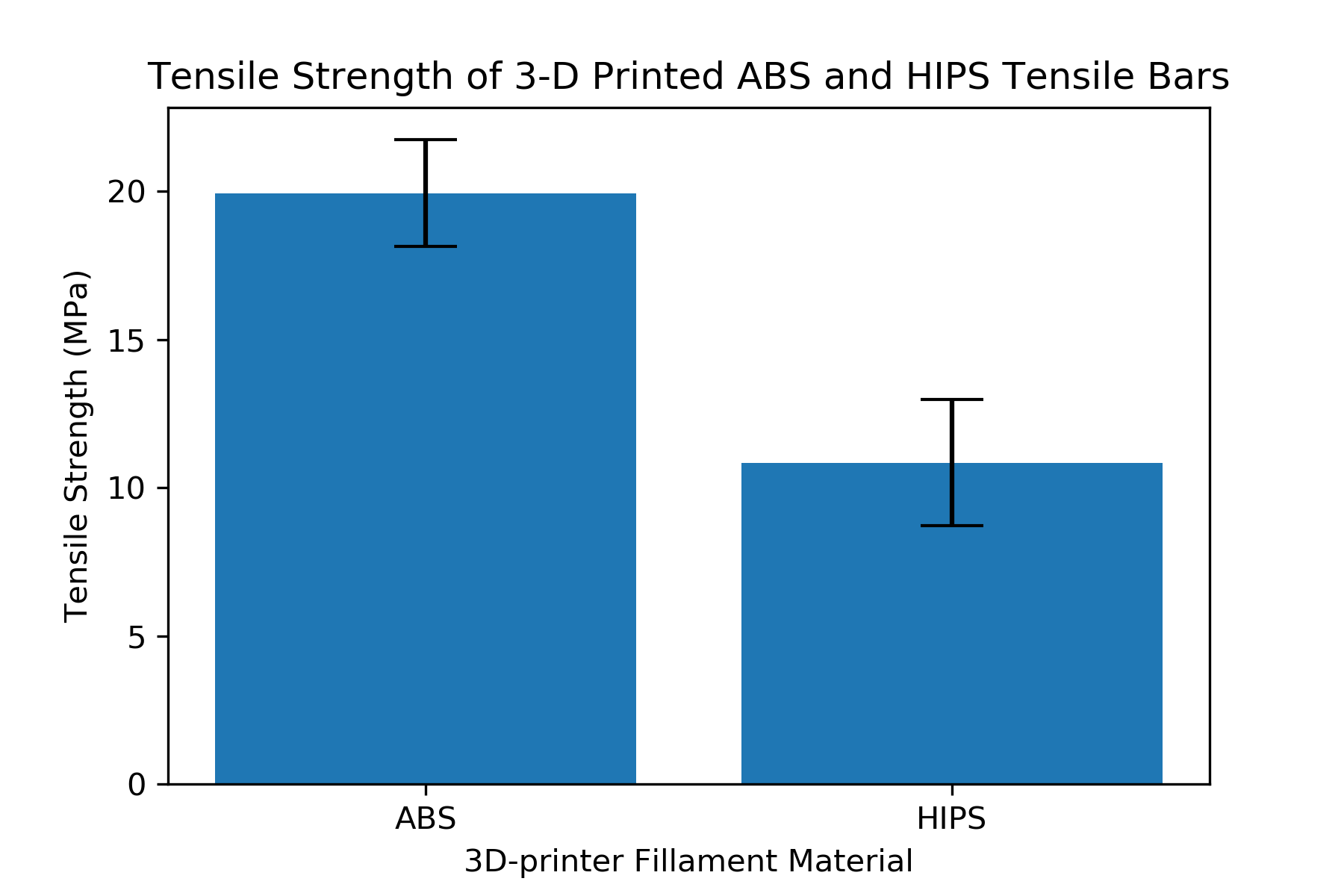
# build the bar plot
plt.bar(['ABS', 'HIPS'],[ABS_mean, HIPS_mean],yerr=[ABS_stdev, HIPS_stdev], capsize=10)
plt.xlabel('3D-printer Fillament Material')
plt.ylabel('Tensile Strength (MPa)')
plt.title('Tensile Strength of 3-D Printed ABS and HIPS Tensile Bars')
plt.show()

Save the plot
The plot looks complete: two bars, x and y axis labels, title and error bars with caps. Now let's save the plot as an image file so we can import the plot into a Word document or PowerPoint presentation. If you are using a jupyter notebook, you can just right-click on the plot and select [copy image] or [Save Image As...]. To save a plot as an image programmatically, we use the line:
plt.savefig('filename.extension')Matplotlib will save the plot as an image file using the file type we specify in the filename extension. For example, if we call plt.savefig('plot.png'), the plot will be saved as a .png image. If we call plt.savefig('plot.jpg') the plot will be saved as a .jpeg image.
# build a bar plot and save it as a .png image
plt.bar(['ABS', 'HIPS'],[ABS_mean, HIPS_mean],yerr=[ABS_stdev, HIPS_stdev], capsize=10)
plt.xlabel('3D-printer Fillament Material')
plt.ylabel('Tensile Strength (MPa)')
plt.title('Tensile Strength of 3-D Printed ABS and HIPS Tensile Bars')
plt.savefig('plot.png')
plt.show()
Increase the .png file image resolution
Depending on how the .png image file is viewed: in a jupyter notebook, on the web, in a Word document or in a PowerPoint presentation, the image may look a little blurry. This is because the .png image we created has a fairly low resolution. We can change the resolution by coding:
plt.savefig('filename.png', dpi = 300)Where dpi=300 specifies a resolution of 300 dots per square inch. We can specify a higher resolution or lower resoltution then 300 dpi. A higher resolution will increase the image file size, but will look better when magnified.
# build a bar plot and save it as a .png image
plt.bar(['ABS', 'HIPS'],[ABS_mean, HIPS_mean],yerr=[ABS_stdev, HIPS_stdev], capsize=10)
plt.xlabel('3D-printer Fillament Material')
plt.ylabel('Tensile Strength (MPa)')
plt.title('Tensile Strength of 3-D Printed ABS and HIPS Tensile Bars')
plt.savefig('plot.png', dpi = 300)
plt.show()
The full script
A summary of the full script is below:
# import packages
from statistics import mean, stdev
import matplotlib.pyplot as plt
#include if using a jupyter notebook, remove if using a .py file
%matplotlib inline

# data
ABS = [18.6, 21.6 ,22, 21, 18, 20.9, 21, 19.3, 18.8, 20, 19.4, 16, 23.8, 19.3, 19.7, 19.5]
HIPS = [10.4, 4.9, 10.2, 10.5, 10.9, 12.9, 11.8, 8.4, 10, 10.6, 8.6, 9.7, 10.8, 10.7, 11, 12.4, 13.3, 11.4, 14.8, 13.5]

# find the mean using the mean() function from the statistics library
ABS_mean = mean(ABS)
HIPS_mean = mean(HIPS)

# find the standard deviation using the stdev() function from the statistics library
ABS_stdev = stdev(ABS)
HIPS_stdev = stdev(HIPS)

# build a bar plot and save it as a .png image
plt.bar(['ABS', 'HIPS'],[ABS_mean, HIPS_mean],yerr=[ABS_stdev, HIPS_stdev], capsize=10)
plt.xlabel('3D-printer Fillament Material')
plt.ylabel('Tensile Strength (MPa)')
plt.title('Tensile Strength of 3-D Printed ABS and HIPS Tensile Bars')
plt.savefig('plot.png', dpi = 300)
plt.show()