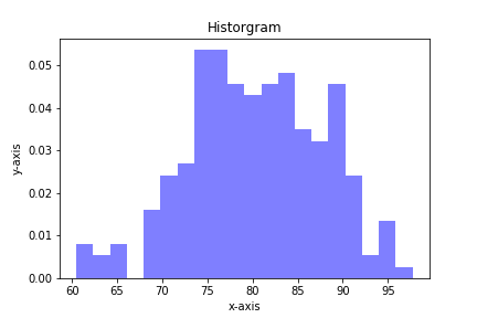
Histograms are a useful type of statistics plot for engineers. A histogram is a type of bar plot that shows the frequency or number of values compared to a set of value ranges. Histogram plots can be created with Python and the plotting package matplotlib. The plt.hist() function creates histogram plots.
Before matplotlib can be used, matplotlib must first be installed. To install matplotlib open the Anaconda Prompt (or use a terminal and pip) and type:
> conda install matplotlib
or
$ pip install matplotlib
If you are using the Anaconda distribution of Python, matplotlib is already installed.
To create a histogram with matplotlib, first import matplotlib with the standard line:
import matplotlib.pyplot as plt
The alias plt is commonly used for matplotlib's pyplot library and will look familiar to other programmers.
In our first example, we will also import numpy with the line import numpy as np. We'll use numpy's random number generator to create a dataset for us to plot. If using a Jupyter notebook, include the line %matplotlib inline below the imports.
import matplotlib.pyplot as plt
import numpy as np
# if using a Jupyter notebook, includue:
%matplotlib inline
For our dataset, let's define a mean (average) mu = 80 and a standard deviation (spread) sigma = 7. Then we'll use numpy's np.random.normal() function to produce an array of random numbers with a normal distribution. 200 random numbers is a sufficient quantity to plot. The general format of the np.random.normal() function is below:
var = np.random.normal(mean, stdev, size=<number of values>)
mu = 80
sigma = 7
x = np.random.normal(mu, sigma, size=200)
Matplotlib's plt.hist() function produces histogram plots. The first positional argument passed to plt.hist() is a list or array of values, the second positional argument denotes the number of bins on the histogram.
plt.hist(values, num_bins)
Similar to matplotlib line plots, bar plots and pie charts, a set of keyword arguments can be included in the plt.hist() function call. Specifying values for the keyword arguments customizes the histogram. Some keyword arguments we can use with plt.hist() are:
density=histtype=facecolor=alpha=(opacity).
plt.hist(x, 20,
         density=True,
         histtype='bar',
         facecolor='b',
         alpha=0.5)

plt.show()
Our next histogram example involves a list of commute times. Suppose the following commute times were recorded in a survey:
23, 25, 40, 35, 36, 47, 33, 28, 48, 34,
20, 37, 36, 23, 33, 36, 20, 27, 50, 34,
47, 18, 28, 52, 21, 44, 34, 13, 40, 49
Let's plot a histogram of these commute times. First, import matplotlib as in the previous example, and include %matplotib inline if using a Jupyter notebook. Then build a Python list of commute times from the survey data above.
import matplotlib.pyplot as plt
# if using a Jupyter notebook, include:
%matplotlib inline

commute_times = [23, 25, 40, 35, 36, 47, 33, 28, 48, 34,
                 20, 37, 36, 23, 33, 36, 20, 27, 50, 34,
                 47, 18, 28, 52, 21, 44, 34, 13, 40, 49]
Now we'll call plt.hist() and include our commute_times list and specify 5 bins.
plt.hist(commute_times, 5)

plt.show()
If we want our bins to have specific bin ranges, we can specify a list or array of bin edges in the keyword argument bins=. Let's also add some axis labels and a title to the histogram. A table of some keyword arguments used with plt.hist() is below:
| keyword argument | description | example |
|---|---|---|
bins= |
list of bin edges | bins=[5, 10, 20, 30] |
density= |
if true, data is normalized |
density=false |
histtype= |
type of histogram: bar, stacked, step or step-filled | histtype='bar' |
color= |
bar color | color='b' |
edgecolor= |
bar edge color | color='k' |
alpha= |
bar opacity | alpha=0.5 |
Let's specify our bins in 15 min increments. This means our bin edges are [0,15,30,45,60]. We'll also specify density=False, color='b'(blue), edgecolor='k'(black), and alpha=0.5(half transparent). The lines plt.xlabel(), plt.ylabel(), and plt.title() give our histogram axis labels and a title. plt.xticks() defines the location of the x-axis tick labels. If the bins are spaced out at 15 minute intervals, it makes sense to label the x-axis at these same intervals.
bin_edges = [0,15,30,45,60]

plt.hist(commute_times,
         bins=bin_edges,
         density=False,
         histtype='bar',
         color='b',
         edgecolor='k',
         alpha=0.5)

plt.xlabel('Commute time (min)')
plt.xticks([0,15,30,45,60])
plt.ylabel('Number of commuters')
plt.title('Histogram of commute times')

plt.show()
Summary
In this post we built two histograms with the matplotlib plotting package and Python. The first histogram contained an array of random numbers with a normal distribution. The second histogram was constructed from a list of commute times. The plt.hist() function takes a number of keyword arguments that allows us to customize the histogram.