In this post, you'll see how to add an inset curve to a Matplotlib plot. An inset curve is a small plot laid on top of a main larger plot. The inset curve is smaller than the main plot and typically shows a "zoomed in" region of the main plot.
This is the second post in a series of posts on how to plot stress-strain curves with Python and Matplotlib. In the previous post in the series we built a stress-strain curve from the data in two .xls data files.
The plot built in the previous post included two lines, axes labels, a title, and legend. The data in the plot came from two .xls excel files and was from a tensile test of two metal samples. We are going to build upon that plot by adding an inset curve to it.
Pre-requisits
In order to build an inset curve with Matplotlib, you'll need to have a couple of things in place:
- Computer
- Python
- Matplotlib, NumPy, and Pandas
- Jupyter notebook (optional)
- Data
Computer - to recreate the inset curve in this post, you'll need a computer. A laptop or desktop computer will both work. While it's possible to create the inset curve with a Chromebook, tablet, or phone - that's a bit more complicated and beyond the scope of this post.
Python - You need to have Python installed on your computer. I recommend installing the Anaconda Distribution of Python. See this post to see how to install Anaconda on your computer.
Matplotlib, NumPy, and Pandas - We'll build our inset curve using a Python plotting library called Matplotlib. Matplotlib is one of the most popular Python plotting libraries. If you installed Anaconda, Matplotlib is already installed. If you installed Python from somewhere else, you'll need to install Matplotlib. NumPy is a Python library for numeric computation. We'll use NumPy to make a few calculations. Pandas, a Python library for working with tabular data, will help us bring the data into our Python program.
You can install Matplotlib, NumPy, and Pandas with the Anaconda Prompt using the commands below:
> conda install matplotlib numpy pandas
Alternatively, you can use a terminal and the Python package manager pip to install Matplotlib, NumPy, and Pandas.
$ pip install matplotlib numpy pandas
Jupyter notebook - This is optional, but you can enter the code in this post into a Jupyter notebook and see the plot produced in the same Jupyter notebook. Alternatively, you can enter the code into a .py file and run the .py file to produce the plot. As long as the Anaconda distribution of Python is installed on your computer, you use a Jupyter notebook. See how to open Jupyter notebook in this post.
Data - The data we are going to plot is from two .xls data files. You can download these files using the links below:
Move these .xls data files into the same folder on your computer as your Jupyter notebook or .py file that contains your code.
Once these pre-requisites are in place, it's time to start building our inset curve!
Build the main plot
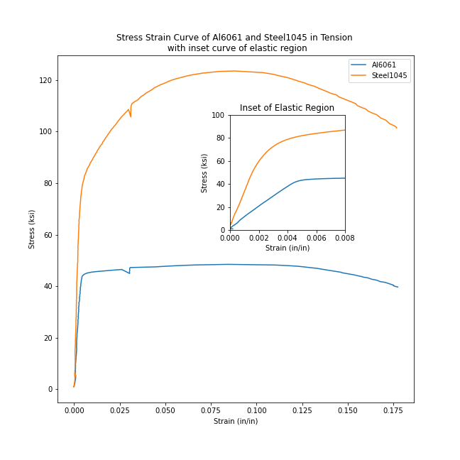
The type of plot we are building is called a stress-strain curve. Stress-strain curves are used by engineers to demonstrate how a material deforms under stress. We are going to add an inset curve on top of our stress-strain curve that highlights the linear elastic region. An inset curve is a small plot that is placed on top of the main plot. Inset curves usually show a zoomed-in view of a larger plot. On our stress-strain curve, the inset curve will show a zoomed-in view of the linear elastic region on the plot.
To build our inset curve, we will use Python and Matplotlib's object-oriented interface. The plot from a previous post, was constructed using Matplotlib's pyplot interface. For a simple plot, the pyplot interface above is sufficient. But our plot with an inset curve is more complicated than just a plot with two lines- we are going to add an inset curve.
Matplotlib's object-oriented interface allows us to access individual components of the plot, like axes, and set specific attributes on these components.
Imports
To build our plot with an inset curve, first, we need to import a couple of packages: NumPy, Pandas, and Matplotlib. These three Python packages have common import aliases: np, pd, and plt. The line %matplotlib inline is a Jupyter notebook magic command that results in plots produced within the same Jupyter notebook (as opposed to the plot popping out in a new window). If you are coding your inset curve in a .py file, leave %matplotlib inline out, as it is not valid Python code.
import numpy as np
import pandas as pd
import matplotlib.pyplot as plt
%matplotlib inline
Print Python and package version numbers
The next few lines of code are not required, but can be helpful to others who might use our code again.
The lines of code below print out to version of Python and the versions of the packages we imported above.
import sys
import matplotlib

print(f"Python Version: {sys.version}")
print(f"NumPy Version: {np.__version__}")
print(f"Pandas Version: {pd.__version__}")
print(f"Matplotlib Version: {matplotlib.__version__}")
Ensure the two .xls data files are in the same folder as our code
The two external files that contain the data we are going to plot are linked below:
If you are following along and building an inset curve yourself, make sure to download the .xls data files and place these data files in the same directory as your Jupyter notebook or Python script.
A convenient Jupyter notebook magic command, %ls, lists the contents of the current directory (the directory where the notebook is saved). Make sure you can see the two .xls data files in this directory. The %ls command is not valid Python code, so if you are building your plot in a .py file, make sure to leave %ls out.
%ls
We can see the two data files aluminum6061.xls and steel1045.xls in the same folder as our Jupyter notebook stress_strain_curve_with_inset_elastic_region.ipynb
Next, we need to bring in the data from the two external .xls files into variables in our script.
Read the data with Pandas
Next, we'll bring the two .xls data files into our Python script using Panda's pd.read_excel() function. The result is two Pandas data frames called steel_df and al_df which contain the data from our two .xls files.
al_df = pd.read_excel("aluminum6061.xls")
steel_df = pd.read_excel("steel1045.xls")
We can use Panda's df.head() method to view the first five rows of each dataframe.
steel_df.head()
al_df.head()
We see a couple of columns in each data frame. The columns we are interested in are below:
- FORCE Force measurements from the load cell in pounds (lb)
- EXT Extension measurements from the mechanical extensometer in percent (%), strain in percent
- CH5 Extension readings from the laser extensometer in percent (%), strain in percent
We will use these columns from the data frames in the following ways:
- FORCE will be converted to stress using the cross-sectional area of our test samples
- EXT (mechanical extensometer readings) will be converted into strain on our inset curve
- CH5 (laser extensometer readings) will be converted into strain on the overall, large stress-strain curve
strain_al_plastic = al_df['CH5']*0.01
strain_al_elastic = al_df['EXT']*0.01
d_al = 0.506
stress_al = (al_df['FORCE']*0.001)/(np.pi*((d_al/2)**2))

strain_steel_plastic = steel_df['CH5']*0.01
strain_steel_elastic = steel_df['EXT']*0.01
d_steel = 0.506
stress_steel = (steel_df['FORCE']*0.001)/(np.pi*((d_steel/2)**2))
Build a simple plot
Now that we have the data in 6 panda's series, we can build a simple plot.
We'll use Matplotlib's object-oriented interface to create two objects, a figure object called fig and an axes object ax1. Then we can run the .plot() method on our ax1 object and pass in two sets of series. The command plt.show() shows the plot.
fig, ax1 = plt.subplots()
ax1.plot(strain_al_plastic,stress_al,strain_steel_plastic,stress_steel)
plt.show()

We see a plot (a stress-strain curve) with two lines. Right now, the plot looks pretty bare. We can spruce it up a bit with axis labels, a title, and a legend.
Add axis labels, a title, and a legend
Next, let's use Matplotlib's object-oriented interface to add axis labels and titles. Below is a chart that relates how to use Matplotlib's plt approach, compared to the object-oriented approach that we'll use.
| plot component | plt approach |
object-oriented approach |
|---|---|---|
| x-axis label | plt.xlabel('strain') |
ax.set_xlabel('strain') |
| y-axis label | plt.ylabel('stress') |
ax.set_ylabel('stress') |
| title | plt.title('stress-strain curve') |
ax.set_title('stress-strain curve') |
| legend | plt.legend(['Al6061','Steel1045']) |
ax.legend(['Al6061','Steel1045']) |
fig, ax1 = plt.subplots()
fig.set_size_inches([9,9])
ax1.plot(strain_al_plastic,stress_al,strain_steel_plastic,stress_steel)
ax1.legend(['Al6061','Steel1045'])
ax1.set_xlabel('Strain (in/in)')
ax1.set_ylabel('Stress (ksi)')
ax1.set_title('Stress-Strain Curve of Al6061 and Steel1045 in Tension')

plt.show()

We see a plot with two lines, axis labels, a title, and a legend. Now, onto adding the inset curve!
Add the inset curve
Next, let's add our inset curve. Our inset curve is a zoomed-in view of the linear elastic region (the far left, almost vertical portion of the stress-strain curves). To create a plot on top of another plot (our inset curve), we'll use Matplotlib's fig.add_axes([ ]) method. This method outputs a new axis object ax2. ax2 will be the axes that we plot the inset curve on. We can set attributes like .set_xlabel() on our ax2 object to add labels to the axis, a title, and limit the x and y-axis so we only show the left-most portion of the curve.
fig, ax1 = plt.subplots()
fig.set_size_inches([9,9])

ax1.plot(strain_al_plastic,stress_al,strain_steel_plastic,stress_steel)
ax1.legend(['Al6061','Steel1045'])
ax1.set_xlabel('Strain (in/in)')
ax1.set_ylabel('Stress (ksi)')
ax1.set_title('Stress-Strain Curve of Al6061 and Steel1045 in Tension \n with inset curve of elastic region')

left, bottom, width, height = [0.5, 0.5, 0.25, 0.25]
ax2 = fig.add_axes([left, bottom, width, height])
ax2.plot(strain_al_elastic,stress_al,strain_steel_elastic, stress_steel)
ax2.set_xlabel('Strain (in/in)')
ax2.set_ylabel('Stress (ksi)')
ax2.set_title('Inset of Elastic Region')
ax2.set_xlim([0,0.008])
ax2.set_ylim([0,100])

fig.savefig('stress_strain_curve_with_inset.png')

plt.show()

We see a plot that contains an inset curve. The inset curve has two lines, just like the large plot. The inset curve has axis labels and a title. The same colors in the main plot are used in the inset plot. The inset curve shows a zoomed-in view of the larger plot. Note how the x-axis and y-axis limits of the main plot and the inset curve are different.
Summary
In this post, we plotted a stress-strain curve with Python and Matplotlib then added an inset curve on top of our main plot. We used Matplotlib's object-oriented interface to create the inset curve.
The code to remember if you want to add an inset curve on top of a Matplotlib plot is below:
fig, ax1 = plt.subplots()

ax1.plot(x,y)

left, bottom, width, height = [0.5, 0.5, 0.25, 0.25] # modify to move the inset curve and change its size
ax2 = fig.add_axes([left, bottom, width, height])
ax2.plot(x,y)
ax2.set_xlim([lower,upper])
ax2.set_ylim([lower,upper])

plt.show()
Support
Want to learn about building more plots with Matplotlib? Check out my book Problem Solving with Python on Amazon (Affiliate Link):
